
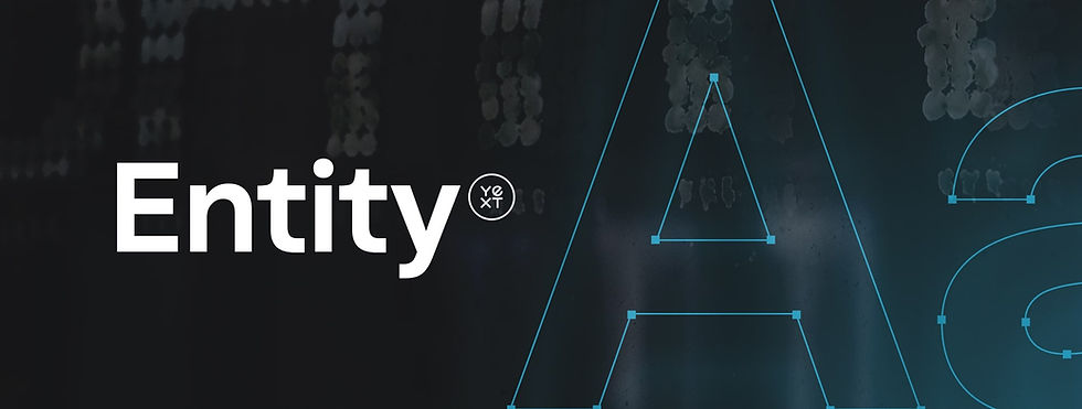
A bespoke typeface for a new era
As part of a brand refresh, I identified an opportunity to elevate the brand through typography. I led an evaluation of multiple type foundries, balancing creative range, technical rigor, and long-term scalability while managing budget constraints throughout the process. The result was Yext Entity, a bespoke typeface designed for clarity, readability, and style. As a type design geek, it was a rare opportunity to align craft, strategy, and long-term brand impact.
ROLE
Art Director
TEAM
Kyla Jordan
Sr. Director of Brand
Dalton Maag
Type Foundry
Dalton Maag kicked off the project with discovery sessions to understand what we needed from a brand typeface. I led the initiative internally, bringing together partners from creative, web design, and content to ensure the typeface worked for the people who would use it day to day. Input from each team shaped a system that felt expressive, practical, and grounded in real brand use.
I coordinated feedback and alignment across the creative team and key stakeholders while working against a defined timeline to implement the typeface across our web properties and eliminate licensing fees from our existing font. I also provided comprehensive feedback to the type design team to help shape a typeface that felt distinctive and tailored to our brand.


Entity in use


Impact
Creating Yext Entity gave the brand a typographic voice that was truly its own and consistent across product, marketing, and content. Having a custom typeface removed many of the limitations that come with off-the-shelf fonts and gave teams more flexibility while improving clarity and cohesion at scale. From a business perspective, moving away from third-party font licenses eliminated hundreds of thousands of dollars in recurring costs, with the investment in the typeface expected to pay for itself within two years. In the long run, Entity became a foundational brand asset that balanced craft, usability, and real financial impact.


